Everest Records
Visual Design and Brand Identity

Timeline: August 2020 - December 2020
Role: Graphic Designer
A special thanks to: Jenn de la Fuente, for allowing me to be my creative self in all of your classes.
“Design the branding and creative direction for a record label you would own!” My design professor, Jenn de la Fuente, prompts all her students to not only learn the fundamentals of elegant design, but to also have conviction about what we are creating and what it will visually communicate. For my first adventure into visual identity, I took full control over a brand and merchandise concept that reflects my favorite musical genre, indie-electronic pop.
I present to you: Everest Records.

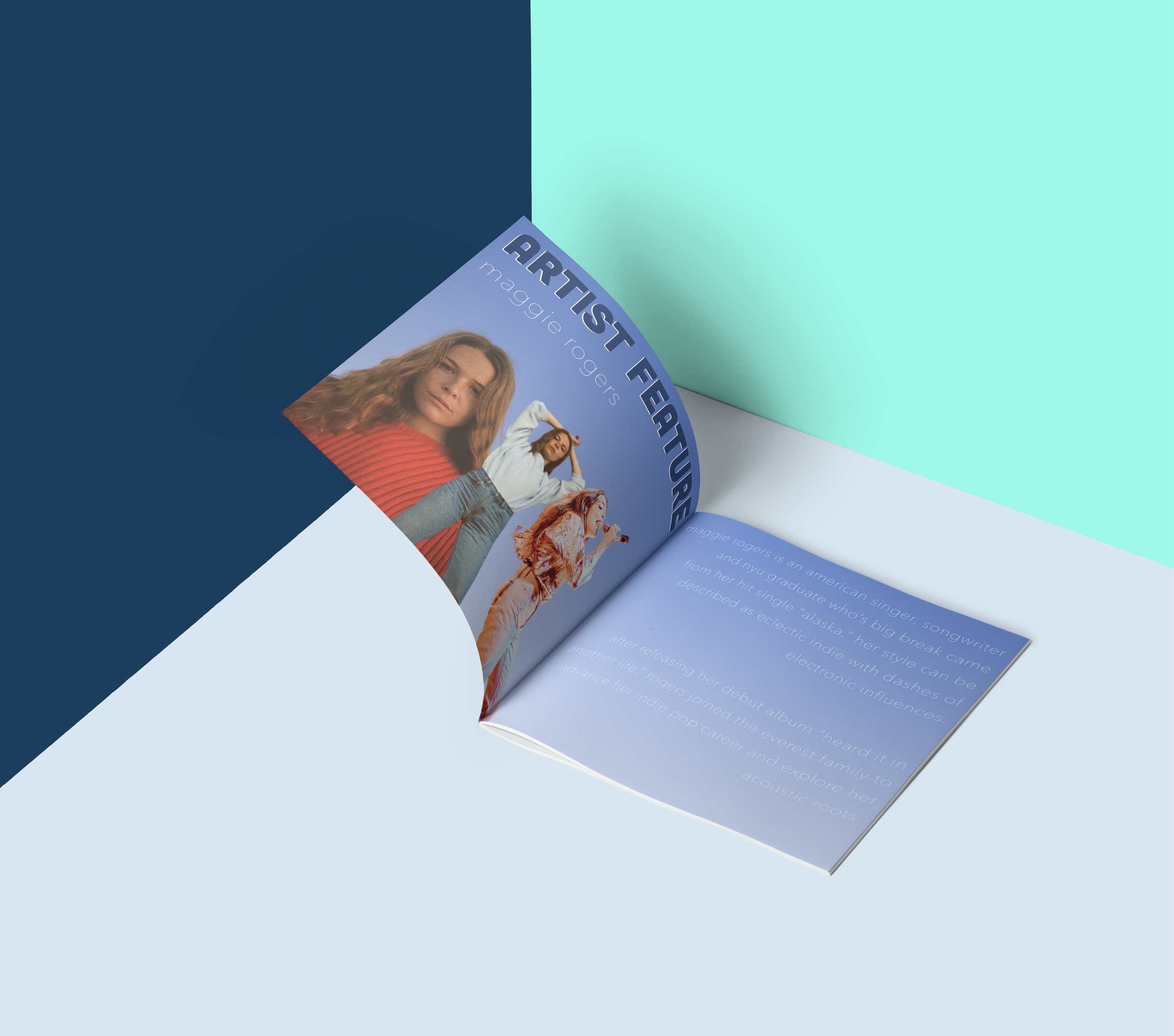
Inspired by aurora borealis and the starry night skies, the Everest Records concept came out of ethereal and euphoric intention, a mixing of musical influences. It focuses on the authenticity of folk and indie pop artists tinged with subtle electronic production.


All of the visual components, from the hues to the layout, have a nod to natural essences. Nature, from the mountains to the seas to the skies, is raw and pure. This is the feeling I wanted my designs to evoke through the lavender purples, mint greens, and navy blues.

